Japanese art works in modern interiors because it lowers the noise.
Most rooms are not badly designed. They are overactive. Too many objects trying to add character. Too many surfaces competing at the same volume. Too many decisions made in the hope that one more thing will make the space feel finished — when what would actually finish it is removing something.
Japanese artwork corrects that. It brings shape, calm, and presence without making the room louder. That is also why it suits modern interiors so naturally. These spaces look best when they feel controlled rather than crowded, and Japanese prints already understand that.
This guide is about using that quality properly. Choosing the right print. Getting the scale right. Letting the artwork be the most specific thing in the room.
Start with the Room, Not the Print
Most people choose artwork by recognition. A famous wave. A bird they like. A print that seems tasteful on its own.
That instinct is not wrong. But it often leads to a piece that is good in isolation and wrong in the space.
A better question: what is this room getting wrong?
It is busy. There is already too much happening. The artwork needs to reduce pressure, not add another event.
It is flat. Nothing is offensive, but nothing is holding the room together. The artwork needs more structure.
It is cold. The room is clean but slightly hard. The artwork should soften it without becoming sentimental.
It is directionless. No centre of gravity. The artwork needs enough presence to become one.
Answer that question honestly and the choice becomes much easier. A print can be beautiful and still be the wrong answer for a specific room.
Match the Print to the Room
Living Room
A living room wall usually needs a print that can settle the space, not just sit on it. This is where stronger landscapes, wave-led compositions, and images with clear graphic structure tend to work best. The room can take more visual weight than people think. What it cannot take is indecision.
Bedroom
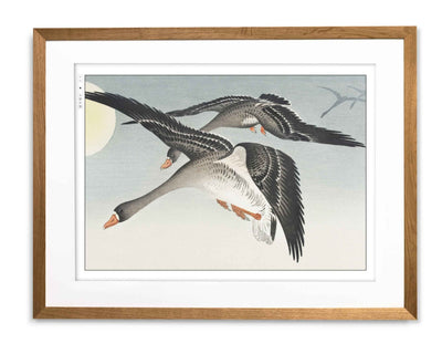
Bedrooms benefit from quieter artwork — bird prints, softer seasonal works, compositions with more negative space. Nothing too forceful above the bed. Nothing that keeps the room visually alert. A bedroom should not feel empty. It should feel easy.
Hallway or Study
Smaller spaces reward precision over ambition. A single vertical print or a refined bird study will usually outperform anything too expansive. These spaces rarely want drama. They want a clear decision.
Minimal Room
The cleaner the room, the more a weak decision shows. One strong print usually does more than several medium ones. On the wall, small often reads as hesitation rather than restraint.
Layered Room
If the room already has natural wood, softer textiles, or warmer neutrals, quieter Japanese prints often integrate better than sharper graphic ones. The artwork should deepen the room — not cut across it.


Know What Each Artist Brings
Hokusai: Structure and Movement
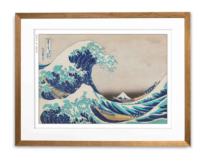
Hokusai’s prints arrive with organised force. The Great Wave off Kanagawa is the clearest example — vast, but not sprawling. Every element has a job. The boats are small enough to make the danger feel human. Fuji holds steady in the distance. Nothing is wasted.
In a room, that precision does something specific: it gives the eye somewhere exact to land. The space around the print becomes clearer because the print itself is so resolved.
Choose Hokusai when the room needs a stronger shape — when it feels too still, too loose, or slightly underpowered. He works best in living rooms, on larger walls, in interiors that need a focal point without becoming dramatic. Browse the Hokusai collection.
For more on his work, see Ukiyo-e: Origins and Influence.
Koson: Quiet and Precision
Koson’s prints do not dominate. They settle.
In Kingfisher and Irises, the bird is placed with care, the irises give it context without crowding it, and the space around both is held rather than empty. Nothing in the image is trying too hard. That restraint makes the image feel completely resolved — and that resolution spreads into the room around it.
Choose Koson when the room needs to calm down without losing feeling. He works best in bedrooms, hallways, and studies — spaces that already look good but feel slightly too exposed or sharp. Browse the Ohara Koson collection.
For more on how his work carries feeling through stillness, see The Role of Nature in Japanese Art.
Taguchi Tomoki: Contemporary Clarity
Where Hokusai adds force and Koson adds classical quiet, Taguchi Tomoki brings Japanese visual sensibility into a sharper, more current register. His work does not carry the same historical weight — and in certain rooms, that is precisely what is needed.
Choose Taguchi Tomoki when older print language would feel too formal or too weighted for the space. He works best in apartments, sharper contemporary interiors, and rooms where historic work might feel like it is making a statement the room did not ask for. Browse the Taguchi Tomoki collection.
Get the Scale Right
A lot of good artwork is weakened by scale. People mistake smallness for sophistication. On the wall, that usually reads as hesitation.
If the artwork is too small for the space, it does not look disciplined. It looks lost.
Do not centre a small print on a large blank wall and expect it to hold. It usually will not.
Give stronger work more empty wall around it. A Hokusai print needs space to keep its edge — crowd it and the force dissipates.
Let quieter work breathe without letting it vanish. A Koson print can be delicate and still have presence. The mistake is scaling it down until restraint becomes weakness.
When uncertain, choose one larger piece over several slightly undersized ones. One exact decision almost always looks better than three polite ones.
Rooms feel more considered when they look edited. Undersized art usually works against that.
Let the Artwork Be the Most Specific Thing in the Room
This is where most interiors go wrong.
The temptation, once a Japanese print is on the wall, is to support it — to build the room around it, to add things that feel sympathetic, to layer in other references that confirm the direction. A blossom motif here. A lamp that nods to Japanese design. Objects chosen to reinforce what the print has already said.
The room starts explaining itself. And a room that is explaining itself is not a room that feels considered. It is a room that feels decorated.
The stronger move is the opposite. Let the print carry all of the specificity on its own. The furniture stays modern. The palette stays restrained. The materials stay quiet. Nothing in the room is trying to make the same argument the print is already making.
When that works, the print does not feel placed. It feels inevitable. The room was already almost right. The print was the last decision that made it so.
What supports this without competing: natural wood, linen, cotton, wool, stone or ceramic texture, matte finishes, black accents used sparingly, controlled colour.
What undermines it: obvious themed styling, accessories making the same cultural argument as the print, anything that makes the room feel like it is building a concept rather than making a home.
A room looks better when nothing in it is trying too hard. That is part of what makes restraint feel considered rather than sparse.
Stay in One Visual Direction
Not every Japanese print belongs in the same room. A strong wave print, a delicate bird study, and a contemporary graphic piece may each be excellent. That does not mean they should live together.
Choose one dominant register and stay within it.
Calm and spacious: bird prints, quieter landscapes, softer seasonal work.
Structured and graphic: Hokusai, clearer line, stronger composition, more visual authority.
Soft and natural: nature-led work with muted colour and gentler rhythm.
Clean and contemporary: more modern pieces with sharper graphic discipline.
A simple test: if the pieces would look confused beside each other in a display, they will feel confused in the room.
You can mix within one direction. What fails is trying to represent all of Japanese art in a single room.
For help displaying prints once you have chosen them, see Anime Wall Art, Done Right and Choosing Frames for Manga Artwork.
The Room That Does Not Need to Explain Itself
The rooms where Japanese art works best are the ones that have already done the editing.
They have removed what was not earning its place. Cleared what was trying too hard. Stopped before the space felt finished in the wrong way.
Into that room, one good print does not decorate. It resolves. It becomes the thing the space was quietly waiting for — not because it adds something missing, but because it is exact enough to make everything around it feel intentional.
That is what restraint looks like when it is working. Not empty. Not sparse. Resolved.
Choose the piece that corrects the room. Give it enough scale. Let it be the most specific thing in the space. Then stop.
The Eastern Archivals Archive
Japanese art prints, manga artwork, and anime wall art — printed on archival matte paper.
Shop the Archive