One print on a wall is easy. It either holds or it doesn’t.
The difficulty starts with two. Then three. Suddenly there are four prints up and the wall is full but nothing leads, nothing gives way, and the eye has nowhere to rest. The prints are good. The series are loved. But the wall doesn’t work.
This guide fixes that. Seven decisions, in order.
Test the Print Before You Commit
One question decides whether an image belongs on a wall: does it still hold without the episode behind it?
Strip the soundtrack. The build-up. The memory of what comes next. If the image still gives you something on its own — shape, mood, a quality of light, a figure that reads instantly — it earns its place. If it needs the episode to explain why it matters, the wall cannot provide that.
The strongest anime prints work in one of three ways. Strong silhouette that reads at distance. Atmosphere that survives in still form. Colour controlled enough that the feeling stays once the screen goes dark.
Not every image you love will pass. That is not a reason to love it less. It is a reason to keep it somewhere other than the wall.
For more on what makes anime images hold in still form, see Inside Anime’s Visual Identity and Anime as Art: From Screen to Wall.
Know What Each Series Brings to a Wall
Bleach, Naruto, and Ghibli do different jobs. Know the job before you choose the print.
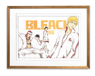
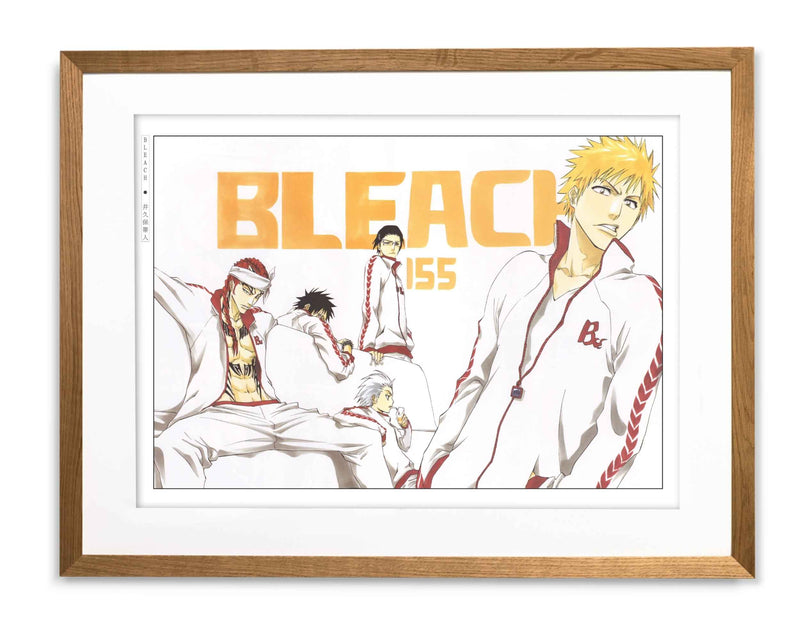
Bleach
Works through reduction. Strong silhouette, controlled line, empty space doing most of the work. It gives a wall authority and a clear visual lead. Start here if you want the display to land with structure. Browse the Bleach collection.
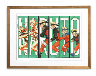
Naruto
Works through the body. A forward lean, a held stance, tension in the shoulders before the face says anything. It brings energy and warmth without spectacle. Use it to support a lead image, not replace one. Browse the Naruto collection.
Studio Ghibli
Works through environment. A sky, a room, a quality of light that has already absorbed the feeling of a scene. It creates breathing room. Use it wherever the wall needs air. Browse the Studio Ghibli collection.

Build Around One Lead Image
Every wall needs one image that lands first. Everything else either supports it or gives it room.
The lead does not need to be the biggest print on the wall. It needs the most authority — clearest silhouette, strongest contrast, or a composition that feels settled while everything around it moves. Bleach usually works well here.
The supporting image gives the display energy. Naruto often plays this role. It adds warmth and movement without competing for the lead.
The relief image stops the wall from feeling packed. This is the piece most people forget. Ghibli usually fills it — spacious enough to let the other prints breathe, present enough that the wall does not feel empty.
One lead. One support. One relief. That is the minimum structure a wall needs. For more on building a display from scratch, see Designing a Manga Gallery Wall.
Sort Colour Before Anything Goes Up
Anime colour is strong. Several prints with no colour plan will start competing before you have finished hanging them.
Decide the register first. If the wall is going sharp and high-contrast, Bleach leads and Ghibli provides relief. If it is going warm and atmospheric, Ghibli or Naruto carries the tone and one firmer image keeps it from going too soft. If it is going energetic, Naruto drives — but needs a more spacious piece beside it or the whole wall tips into noise.
One rule: if every print is equally saturated or equally contrast-heavy, the wall reads flat. Variation in weight is what gives a display depth.
Frame for the Image, Not the Room
Black frames give a print more edge. White frames give it more air.
That is the whole decision.
Black suits prints that are already graphic, dark, or high-contrast. Bleach usually wants black. The frame matches the discipline inside the image.
White suits prints that work through atmosphere, space, or softness. Ghibli usually wants white. The frame steps back and lets the image carry its own register.
Naruto depends on the print. Look at what it needs — more edge, or more air — and choose accordingly.
Consistent spacing matters as much as frame colour. Uneven gaps make strong artwork feel accidental.
One large print is usually better than several small ones. Anime imagery needs physical presence to land properly. Reduce it too far and it becomes decorative.
For more on framing decisions, see Choosing Frames for Manga Artwork.
Mix Series with a Reason, Not Just Affection
Two series can share a wall. They need a reason beyond the fact that you love both.
Bleach and Ghibli: productive contrast. One sharpens, one softens. Each makes the other read more clearly.
Naruto and Ghibli: shared warmth. The right prints from both can carry the same emotional register without competing.
Bleach and Naruto: possible, but only with a clear lead. If both are equally charged, the wall gets crowded fast.
Three or more series without editing: almost always fails. One severe image next to one loud action scene next to one soft landscape at the same scale and pressure does not feel curated. It feels undecided.
Match mood first. Series second.
Edit Until the Wall Earns Its Form
Put the prints up. Step back. Look at the wall as a room, not as a list of things you love.
There is usually one piece that is there because of affection rather than function. It may be a good image. But if it weakens the hierarchy, creates competition, or fills a space that would be stronger empty — it goes.
A good anime wall is usually built by removing one print too many, then putting one back only if it is genuinely missed.
The test is not whether you love every image on the wall. It is whether the wall still works when you stop reading it as anime and start reading it as a room.
The Eastern Archivals Archive
Japanese art prints, manga artwork, and anime wall art — printed on archival matte paper.
Shop the Archive