Anime artwork does something no other medium quite manages.
It takes the inside of a feeling and makes it visible. Not just a face that conveys emotion — the whole world shifts to match it. The sky at the moment of loss goes a particular colour. A character’s grief does not stay private; it bleeds into the weather, the light, the way a road stretches ahead into nothing. Anime externalises interiority, and it does it at a scale that should feel excessive but rarely does.
That scale is also what makes certain frames so striking once the movement stops.
Strip the episode away and you are left with a single image that has already done the work. The colour is still charged. The composition still leans in a direction. Something in the frame is still asking you to feel the weight of the moment.
This essay is about why that happens, and how to find the frames worth keeping. For the longer story of where these visual instincts come from, see How Japanese Art Shaped Modern Visual Culture.
The Visual Language of Anime
The honest way to say it: anime is not embarrassed by emotion.
Other visual forms tend to understate. Manga earns its power through restraint — what is left out, what is left dark, what silence does to a page. Anime works differently. It builds up. It scores. It gives feelings a colour palette, a tempo, an environment that reshapes itself around the person at the centre of the scene.
Naruto does not just feel determined — he runs through a storm with his headband still on. Ichigo does not just feel cornered — the frame tightens and the negative space starts to feel like pressure. One Piece does not just feel joyful — the whole page seems to expand, as if the world itself is making room for how much is happening.
This is not sentimental excess. It is a different visual grammar. The image is not describing a feeling — it is constructing one around you.


The Artists and the Visual Language
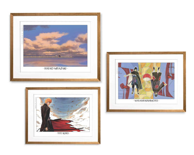
Anime is not one look. Four artists define the range — Tite Kubo, Masashi Kishimoto, Eiichiro Oda, and the team at Studio Ghibli — and each one works in a completely different register. That variety is part of what makes anime artwork so interesting to collect.
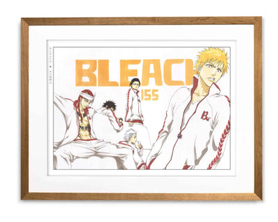
Tite Kubo
Kubo is a lesson in what happens when a great designer becomes a manga artist.
Bleach operates in black, white, and negative space. His instinct is always toward the essential — strip it back, find the line that does all the work, leave the rest as air. The Thousand-Year Blood War arc makes this especially clear: Yhwach and his lieutenants arrive rendered almost as pure silhouette, figures so stripped of detail that posture and shape carry the entire emotional charge. A Bleach frame often contains one figure, one direction of light, and a vast surrounding emptiness. It lands harder than a crowded page would.
What makes it work on a wall is the same thing that makes it work on the page. The image does not need context to have presence. You do not need to know who Ichigo is to feel that the frame has weight. The Bleach collection is where to start if you want something graphic, uncompromising, and quietly unforgettable.

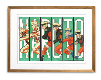
Masashi Kishimoto
Kishimoto’s genius is for the body as emotional instrument.
Naruto is built on emotional readability above everything else. The posture is the story. What makes Kishimoto so precise is how much he puts into the moments between action — the face held just before a decision, the body language of someone who has not yet admitted something to themselves. Naruto leans forward into everything — into the fight, into the moment, into his own uncertainty. Sasuke folds inward from it, closed and deliberate. Kakashi looks like he is always arriving from somewhere else and never quite staying. None of this is explained. It is drawn.
The best Naruto artwork does not just remind you of what happened in the story. It reminds you how the story felt in your chest — which is the harder thing to achieve and the reason the work has lasted.
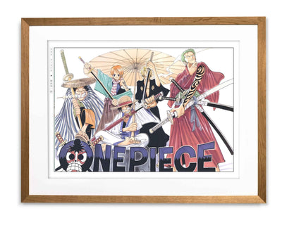
Eiichiro Oda
One Piece is the most joyful thing in manga, and Oda the most underrated craftsman in it.
The scale he maintains — hundreds of characters, dozens of islands, a world that keeps expanding — should produce confusion. It produces abundance instead. Every figure is distinct. Every scene has a readable centre. The Marineford arc is where this becomes undeniable: a battlefield containing hundreds of named characters, each one visually legible, each one placed with intention. Oda knows where the eye goes even in the most crowded frame, and the strongest One Piece collection pieces carry that vitality without spilling it — generous, warm, more carefully constructed than they first appear.
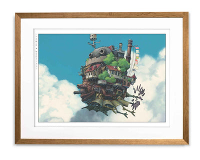
Studio Ghibli
Ghibli is in a register of its own.
Where Bleach compresses and Naruto expands, Ghibli breathes. In Spirited Away, there is a moment where Chihiro stands at the entrance to the bathhouse — small, uncertain, the building enormous and lit against the dark — and the image tells you everything about what the film is going to ask of her before a word has been said. A Ghibli background is not backdrop. It is argument. Loneliness does not happen in a room; it happens in a field so wide the character looks like a dot, with a sky so large it seems to be weighing something.
The Studio Ghibli collection works in rooms that want softness with staying power — images that can hold a space without dominating it.

Colour, Light, and Emotional Temperature
Manga is mostly black and white. The line and the shadow do the emotional work.
Anime adds an entirely different tool: colour as feeling.
Not colour as decoration — colour as information. When the sky in a Ghibli film turns that particular green before a storm, it is not weather. It is a shift in the story’s emotional register, arriving before the dialogue does. When a Naruto sequence moves from the flat warm tones of everyday life into the high-contrast whites and blacks of battle, the change in palette tells you something has become serious before anything has happened.
This is why anime frames often carry a charge that stills from live-action cinema do not. A photograph captures light as it fell. An anime frame invents light as it should feel. The colour is always intentional.
That intentionality is what survives the move to a wall. The image holds its charge because the charge was designed into it, not captured by accident. See Anime Wall Art, Done Right for how to select and frame it well.
Why Anime Belongs on a Wall
A wall does not care whether something moves.
It cares whether the image keeps giving something back. Whether it has enough inside it to justify daily looking — whether on a Tuesday morning when you are not thinking about it, the frame still has something to offer.
The best anime artwork does.
Bleach can make a room feel considered without making it feel cold. Naruto brings warmth and some charge. One Piece is one of the few art forms that can make a space feel genuinely joyful without becoming childish. Studio Ghibli can soften a room and deepen it at the same time, which almost nothing else manages.
The question worth sitting with is not which series you love. It is which image keeps finding your eye. Which one gives something back on the morning after you stopped thinking about the story.
The movement was always the least of it. Strip it away and the best of anime is still there — in the colour, the posture, the space the artist chose not to fill. It was never really a screen thing. It just took a wall to prove it.
The Eastern Archivals Archive
Japanese art prints, manga artwork, and anime wall art — printed on archival matte paper.
Shop the Archive