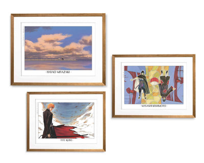
Anime artwork does not need help arriving with force.
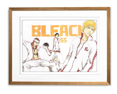
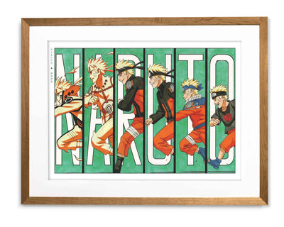
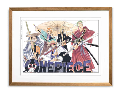
A Bleach image can cut through a room before you have registered the detail. A Naruto print can carry movement and emotional lift through posture alone. A One Piece environment can open a wall with colour and scale that most art cannot match. These images already have pressure inside them.
That is exactly why anime gallery walls go wrong.
The problem is rarely the prints. It is that several strong images, given no structure, start cancelling each other out. Too many focal points. Too much intensity at the same level. Nothing leads. Nothing gives way. The wall gets loud rather than powerful.
This guide is about fixing that. Not by softening the artwork — but by giving it order. A good anime gallery wall does not add excitement to the prints. It organises the excitement that is already there.
Six decisions, in sequence.
Choose the Layout Before You Choose the Prints
Layout is the first decision because it determines how intensity is distributed across the wall.
Centrepiece Layout
Usually the strongest starting point. One print leads with clear authority, the others support or give it room. This suits anime well because many images already have enough presence to carry a wall on their own. If you are unsure where to start, start here.
Grid
Works when you want the wall to feel controlled and graphic. Prints share equal weight in a structured arrangement. This suits sharper anime artwork and images that already sit in the same visual register. The risk is flatness — if every piece has the same intensity, the grid becomes monotonous rather than orderly. Variation inside the grid is essential.

Vertical Stack
Works in narrow spaces — beside furniture, along a slim section of wall. It creates a sense of progression, which can work especially well with anime. Restraint matters here. Two or three prints are usually enough.
Loose Cluster
Can look excellent, but only when it is genuinely controlled. It should feel collected, not random. Without a visible centre of gravity, it quickly starts looking accidental. This is the hardest format to get right and usually requires the most editing.
Choosing the layout first matters because strong images need structure before they need company.
Use Fewer Prints Than You Think
Most anime gallery walls are overbuilt. Three prints usually work better than five.
Anime imagery does not benefit from overcrowding. Intensity multiplies faster than people expect. Two prints can already feel complete when the relationship between them is clear. Three is the safest starting point — it gives you structure, variation, and hierarchy without turning the wall into a crowd. Four can work when sizes and mood are consistent. Beyond that, the editing has to become much stricter.
A simple rule: two prints work well above furniture. Three prints are the standard starting point. Four gives the most formal gallery feel. Five or more usually only work when one image is clearly and unambiguously leading.
Scale matters as much as count. One slightly larger work helps the arrangement settle. When every image is the same size and same intensity, the wall has no hierarchy — it runs at one constant volume without variation.
Anime also benefits from more physical scale than people often expect. Silhouette, colour, and atmosphere need room to register. Reduce everything too far and the wall starts to feel decorative rather than composed.
Give Each Print a Specific Role
A gallery wall improves immediately once each print has a job.
The Anchor
The image with the most authority — darkest, clearest, most structured. It lands first and everything else organises around it. Bleach often works well here. Tite Kubo’s figures have graphic certainty: strong silhouette, controlled line, the kind of presence that holds a wall without competing with what sits beside it. Browse the Bleach collection.
The Energy Piece
Brings movement, body tension, or emotional lift. Naruto often plays this role. Masashi Kishimoto’s art carries motion and emotional readability through posture and expression — it adds charge to the wall without overwhelming the anchor. Browse the Naruto collection.
The Atmosphere Piece
Widens the arrangement. This is where One Piece becomes especially useful, particularly when the image leans into environment and worldbuilding rather than pure character focus. It can lighten a display that risks becoming too graphic, or open a wall that has become too closed. Browse the One Piece collection.
The Relief Piece
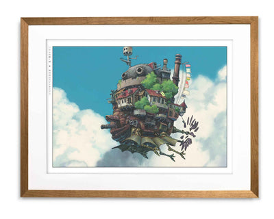
The quietest image — the one that gives the rest of the wall room to breathe. Studio Ghibli often fills this role. A Ghibli print working through sky, light, or open landscape can stop an arrangement from becoming too dense without draining it of feeling. Browse the Studio Ghibli collection.
If every print tries to be the anchor, the wall fails. Intensity without hierarchy produces noise, not power.

Use Background-Led Images to Open the Wall
A gallery wall built entirely from character-led images will feel closed in, even when the individual prints are strong.
Faces, poses, expressions, action. Each one pulls the eye toward itself. Several together with no relief and the arrangement starts to feel claustrophobic — not because anything is wrong with any individual print, but because there is nowhere for the eye to rest.
A background-led image solves this. It still carries emotional weight — a One Piece seascape holds mood and scale, a Ghibli sky carries stillness or weather or the feeling of a world that continues past the frame — but it carries it through space and light rather than a figure. That gives the eye somewhere to pause without breaking the feeling of the wall.
One quieter, more spacious image can improve the entire arrangement simply by creating room inside it. It is not filler. It is structure.
For more on how anime backgrounds carry emotion in still form, see How Anime Backgrounds Create Atmosphere.

Group Prints with a Shared Reason
Once each print has a role, the set still needs a reason to exist together.
Single-Series Wall
The simplest option and often the strongest. A Bleach-only wall already has a unified visual register — sharp, graphic, controlled. A Naruto wall can work when the selected pieces share a consistent emotional range rather than jumping between wildly different moments and moods.
Shared-Mood Wall
Often the more interesting route. Build around severity and contrast — Bleach anchoring, a more open One Piece environment providing relief — and the prints sharpen each other without competing. Or build around warmth and movement — Naruto and One Piece sitting in the same emotional and chromatic register — and the wall feels cohesive rather than assembled.
Contrast Wall
Pairs images that differ deliberately. One severe, one atmospheric. One graphic, one spacious. The contrast has to feel intentional — when it does, the tension between the two makes both read more clearly.
What fails every time is accumulation without editing. Prints chosen because they are loved, not because they belong together. The question is never whether you like every image on the wall. It is whether they have a reason to share it.


Control the Outer Shape and the Spacing
A gallery wall is judged twice: by the prints inside it, and by the shape they make together on the wall.
If the outer edge of the arrangement looks random, the whole thing reads as accidental — even if the individual prints are strong. A square or rectangular footprint usually feels the most stable. A vertical column reads narrower and more directed. A stepped arrangement can work, but only when the rhythm is clear and consistent.
Spacing is the other variable that most people underestimate. Equal gaps between prints help them read as a single composed group rather than a collection of separate objects. Uneven spacing makes even strong artwork feel hesitant.
Leave more blank wall around the arrangement than first seems necessary. A gallery wall needs its own edges — enough surrounding space for the group to hold together as a shape. Without that outer breathing room, strong images start losing their clarity against each other.
Before anything goes on the wall, lay the arrangement out on the floor. This is usually where the truth appears — and where one print reveals itself as the one that should not be there.
That is the real test. Does the arrangement still hold when you stop reading it as anime and start reading it as a room?
For practical framing decisions that support this kind of display, see Choosing Frames for Manga Artwork. For the broader question of how to live with anime prints, see Anime Wall Art, Done Right.
The Eastern Archivals Archive
Japanese art prints, manga artwork, and anime wall art — printed on archival matte paper.
Shop the Archive