Anime art style has a recognisable look. The usual explanations — exaggeration, stylisation, large expressive eyes — describe what it looks like without explaining why it looks that way.
The reason is more structural than it first appears.
An animated image is always at risk of breaking. The moment a frame begins to move, fine detail becomes unstable. Lines start to blur. Forms lose their edges. Information that read clearly in a still image begins to compete with itself.
Anime art style is the set of decisions that prevent this from happening.
Clarity, exaggeration, strong silhouettes, limited palettes, directed composition — these are not stylistic preferences. They are solutions to a specific problem: how to keep an image readable under the pressure of movement and repetition.
That is the structural truth underneath the look.
The Constraint
A still image can afford complexity. The eye can move through it, return to it, spend time inside it.
Motion removes that time.
Once an image begins to move, the viewer cannot linger. Fine detail dissolves. Texture merges into colour. Lines that once felt precise begin to crowd each other. The image does not become denser — it becomes harder to read.
But there is a limit in the other direction too. Strip too much away, and the image loses weight. Without enough structure, it becomes too thin to hold attention, too empty to carry meaning.
Anime art style lives in the narrow space between these two failures.
Too much detail, and the image collapses into noise. Too little structure, and it collapses into nothing. Clarity is the balance point — the condition where the image still holds.
Every decision in anime visual design is working toward that balance. Not because clarity is beautiful, though it often is. Because without it, the image breaks.
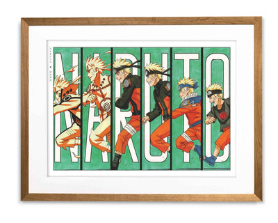
Character Design as Recognition, Not Style
Before a character can convey emotion, it has to register instantly.
This is the first requirement of anime character design, and it shapes everything else.
The silhouette carries the primary responsibility. A strong outline allows a figure to hold even when internal detail disappears — in motion, in shadow, at distance, against a crowded background. The shape still reads before the eye can process anything else.
Exaggeration follows from the same logic. Certain features are emphasised not for drama but for speed. Larger eyes allow emotion to register before the frame changes. Sharp lines communicate severity or control without requiring the viewer to interpret them. Rounded forms read as elasticity or warmth in less time than realism could manage.
Clothing and posture reinforce the system. A coat that extends the silhouette. A stance that remains consistent across scenes. A gesture that becomes identifiable even in partial motion.
None of this is decoration. It is recognition infrastructure.
A character is not designed to be accurate. It is designed to survive recognition under pressure — to remain itself through every condition that animation places it under.
Three Artists, Three Solutions
Anime does not have one visual style. It has multiple ways of staying on the right side of clarity without tipping into collapse.
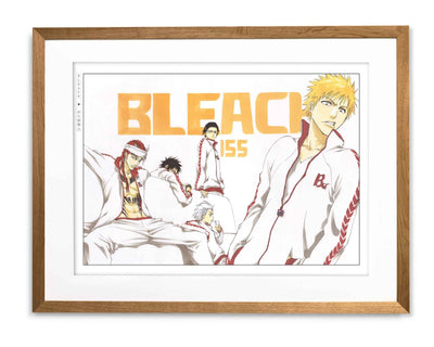
Tite Kubo — Reduction
Kubo’s solution is subtraction.
In Bleach, a figure often occupies open space with almost nothing around it. The line is sharp and clean. The silhouette is unambiguous. There is nothing for the eye to lose track of, and nothing that will dissolve or compete under motion.
The Thousand-Year Blood War arc makes this visible at its most extreme. Yhwach and his lieutenants are rendered almost as pure silhouette — shapes so stripped of surface detail that posture and outline carry the entire emotional charge. The image lands immediately because it has already been reduced to its most stable form.
Kubo moves away from collapse by removal. He takes out anything that could break until nothing left can. Browse the Bleach collection for prints that demonstrate what reduction looks like at its most deliberate.
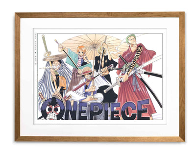
Eiichiro Oda — Controlled Complexity
Oda moves in the opposite direction, and the result holds just as well.
His scenes are crowded, exaggerated, and full of simultaneous movement. At Marineford, hundreds of named characters fill a single battle across dozens of pages. The scale should produce confusion. It produces clarity instead. Every figure has a distinct shape. Every scene has a centre the eye can locate without searching.
The density is real, but it is organised. Each character is drawn with enough distinction that they do not bleed into each other. Each composition has a readable structure even at its most chaotic.
Oda does not avoid the edge. He builds enough control into the image that crossing it becomes difficult regardless of scale. Browse the One Piece collection for prints where that controlled complexity holds at full stretch.
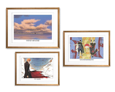
Studio Ghibli — Stability
Ghibli solves the same problem without reduction or exaggeration.
In Spirited Away, Chihiro arrives at the bathhouse for the first time — small, uncertain, the building enormous and lit against the dark. The image is complex in its detail but completely readable. The composition has already resolved the question of where to look.
Ghibli’s approach is environmental. The world around the character is shaped to support the figure rather than compete with it. Space is arranged so that movement can pass through the scene without destabilising it. The frame is not simplified — it is balanced.
Three different approaches. The same constraint underneath each one. Browse the Studio Ghibli collection for prints that show what environmental stability looks like in a room.
Colour and Composition Under Pressure
Colour in anime is not only expressive. It is structural.
A limited palette prevents forms from blending together as they move. Strong contrasts separate elements before the eye needs to distinguish them. Tone is established in advance, so that a shift in colour signals a change in emotional weight before anything in the scene has confirmed it.
A background darkens and the register changes before a word is spoken. A figure brightens against shadow and the focus locks immediately. The colour is doing work that realism would leave to interpretation.
Composition operates the same way.
The frame does not invite exploration. It directs. A figure placed off-centre creates immediate tension. A wide space isolates a subject without requiring explanation. A tight crop removes distraction before it can appear.
The viewer does not search for meaning. The image has already placed it.
These decisions prevent collapse not just in motion but in the still frame that follows. When the movement stops, they remain visible. A composition that held under animation holds on a wall. Colour that carried meaning at twenty-four frames per second carries it in silence just as well. For the practical side of choosing and displaying anime artwork, see Anime Wall Art, Done Right.
What Anime Adds to Manga’s Visual Language
Manga and anime share underlying instincts but operate under fundamentally different conditions.
Manga controls how a moment unfolds. Panels, spacing, and contrast shape time on the page. The reader sets the pace. A single image can be held for as long as it needs to be.
Anime cannot rely on that.
Time moves forward regardless of whether the image is ready. The frame has to remain clear as it changes. Clarity, emphasis, and restraint — the same principles that make manga work — must now hold not across panels but across motion.
The result is that anime tends toward clarity more aggressively than manga can afford to. It is not simply trying to look good. It is trying not to break.
For a closer look at how these instincts develop on the page, see Is Manga Art? Why Panels Are Being Framed and The Evolution of Manga Art Styles.
Why Anime Frames Hold on a Wall
A strong anime frame does not need motion to work.
It has already survived the conditions that would break a weaker image. Motion tested it. What remains is what could hold across movement, repetition, and time.
The silhouette still reads. The composition still directs the eye. The colour still carries its register.
This is not incidental to wall art. It is why certain anime images translate so naturally into a frame.
A Bleach frame brings contrast and clarity — a figure defined against space, a silhouette that reads before the eye has registered the detail. Browse the Bleach collection for prints that hold through that kind of graphic certainty.
A One Piece image carries energy without dissolving into noise, because the structure was already there to contain it. Browse the One Piece collection for prints where the density becomes abundance rather than confusion.
A Ghibli scene can soften a room while still maintaining the compositional balance that keeps it from disappearing. Browse the Studio Ghibli collection for prints that hold space quietly without losing it.
They work on a wall because they were built to survive something harder. For more on how to live with anime artwork, see Anime as Art: From Screen to Wall.
Stability at the Edge
Anime is often remembered for its movement.
But movement is not what defines it.
What defines anime art style is how close it comes to breaking, and how consistently it avoids it. Every line, every exaggeration, every compositional decision is a response to the same pressure: keep the image from collapsing.
Too much detail, and it dissolves. Too little structure, and it disappears. Anime art style holds between those two failures — not as an aesthetic choice, but as the only available option.
Movement made that visible. Structure is what makes it last.
The Eastern Archivals Archive
Japanese art prints, manga artwork, and anime wall art — printed on archival matte paper.
Shop the Archive